This is the second post in a series on building a Power BI report on the COVID-19 data. The source of the data is the COVID-19 Data Repository by the Center for Systems Science and Engineering (CSSE) at Johns Hopkins University. This post builds on the foundation from the previous steps.
- Part 1: Import COVID-19 Data with Power BI
- Part 2: Create a Star Schema with COVID-19 Data in Power BI (This Post)
- Part 3: Create Simple Reports on COVID-19 Cases with Power BI
- Part 4: Modeling Active COVID-19 Cases with Advanced DAX in Power BI
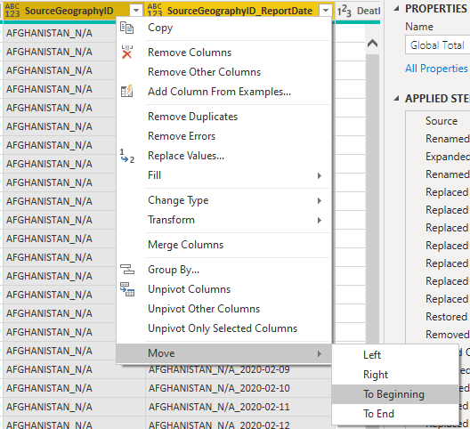
In the previous post we imported the Global Time Series files and merged them into a single query. For ease of presentation, I moved the SourceGeographyID and SourgeGeographyID_ReportDate columns to the beginning by holding ctrl, selecting the columns then right-clicking on one. In the menu select Move > To Beginning.
Time to create visuals! … Or not
Woah there! Hold up a second. While we could now use this query as a table in Power BI, we are not going to do so. There are a few important reasons for this. A good BI developer thinks ahead and should make data easy for end-users to understand.
- The table is large with many rows of repeated data. This will cause the file size to be larger than required and will slow measure calculation and increase processing time when refreshing the data.
- The table has some columns that are not user friendly (
SourceGeographyIDandSourgeGeographyID_ReportDate). We could hide them from users, but it would be better if we can just not load them. - We may want to bring in other data later. Converting this raw table into something more flexible will help with that process in the future.
To avoid these hazards, we will design a star-schema around this query with a few more transformations.
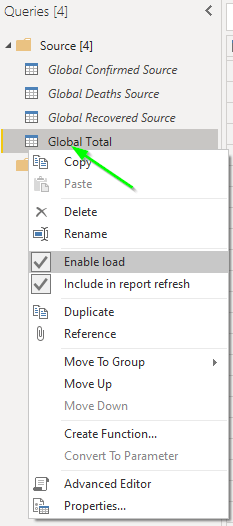
First, let’s disable the load for this query by right-clicking on the query and un-check Enable Load.
Create the Geography Dimension
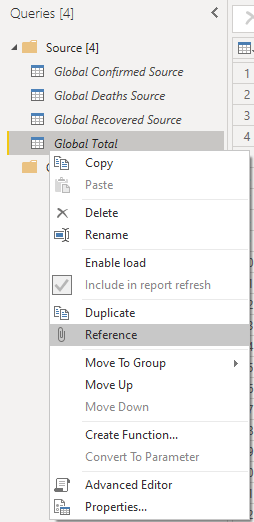
The Global Total query will be used as the source for the Geography dimension. Right-click on it and select Reference.
This creates a new query named Global Total (2). Rename it to Geography then right-click on it and move it to a new query group named Loaded Tables.
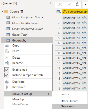
The Loaded Tables query group will be used to organize the queries that will actually be loaded into the user-area of Power BI. By doing this we define a clear area that lets the developer know that care must be taken to not change names or remove fields that would break visuals. This helps with long-term maintenance of a Power BI reporting solution.
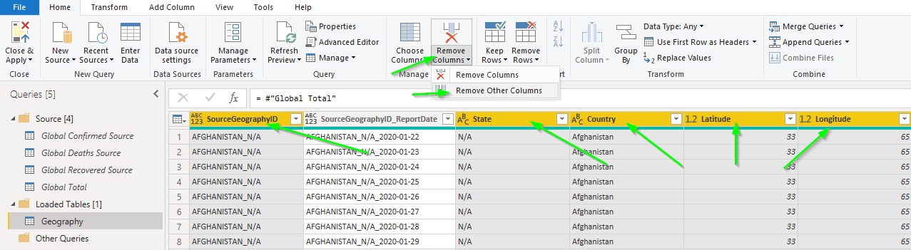
Now we will select the columns that will be part of the Geography dimension. Do this by holding ctrl and selecting SourceGeographyID, State, Country, Latitude' and 'Longitude. Then use the Remove Columns > Remove Other Columns button on the Home ribbon.
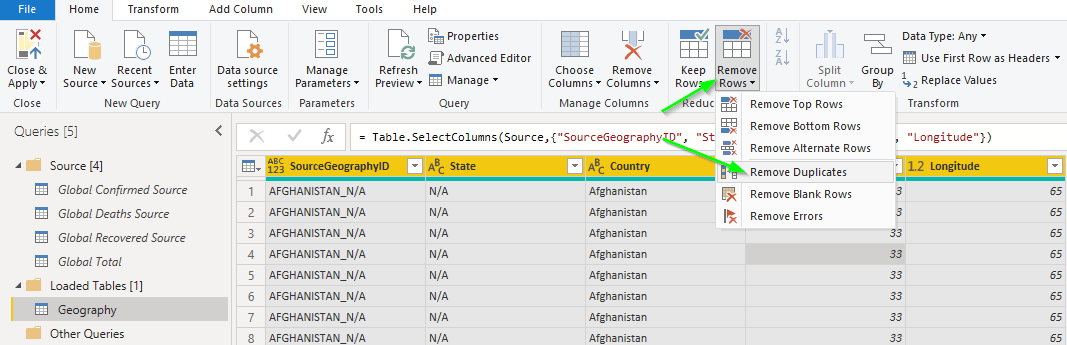
The next step is to remove the duplicate rows by selecting all of the columns with ctrl-a and then Remove Rows > Remove Duplicates. This gives us a much reduced number of rows.
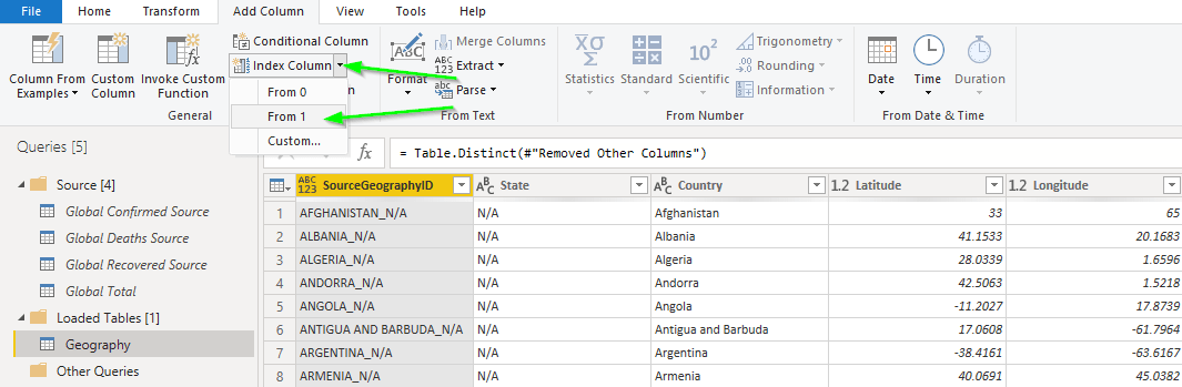
The Tabular engine in Power BI is more efficient when it uses integer values as join keys, so now we will add a Surrogate Key to the dimension. On the Add Column ribbon select Index Column > From 1.
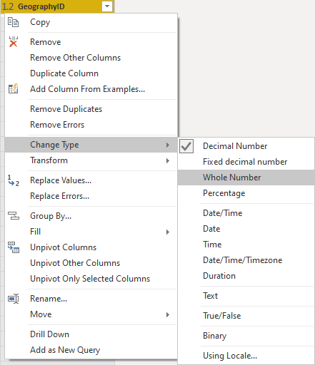
Then rename the new column to GeographyID by right-clicking on it and selecting Rename....
The default data type of this new column is a decimal number. We want it to be a whole number, so right-click on the column and select Change Type > Whole Number.
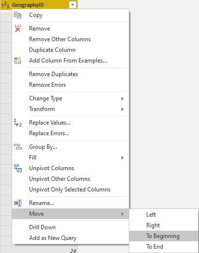
I like to have the columns in my tables in a logical order. Let’s move the new GeographyID to the beginning by right-clicking on it and select Move > To Beginning.
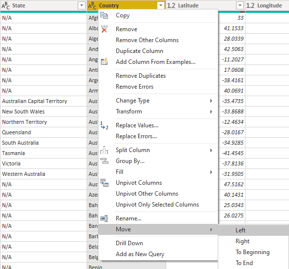
And finally, it makes more sense to me if Country is before State. Right-click on Country and Move > Left.
Do note, the last two steps are completely optional. It’s a matter of preference, but I feel that these steps help to make the user-experience a bit more intuitive.
Add the Fact table!
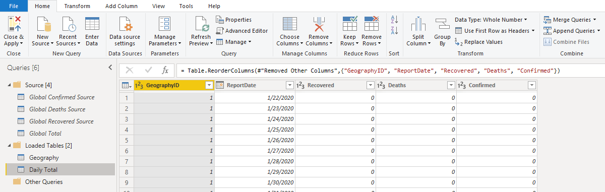
Now we can add the query that will load data to the fact table. We need to get the GeographyID key from the Geography dimension that we just created. Create another query by right-clicking on Global Total and selecting Reference again. Rename the new query from Global Total (2) to Daily Total. Then drag it down into the Loaded Tables query group.
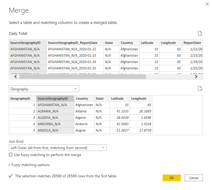
The next step is to merge this new query with the Geography query. Select Merge Queries > Merge Queries from the Home tab of the ribbon. Select Geography as the second table and SourceGeographyID as the join key and a Left Outer join type.
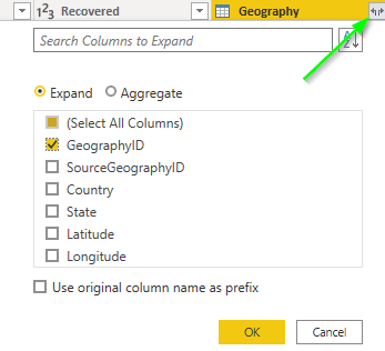
 On the new
 Geography column click the button on the right and select only the GeographyID column. Be sure that Use original column name as prefix is not selected.
We are entering the home-stretch now! A bit of cleanup is all that’s left on the Daily Total query.
- Remove Other Columns than these
Confirmed, Deaths, Recovered, ReportDate, GeographyID. Holdctrlwhile selecting them then click theRemove Columns > Remove Other Columnsbutton. - Move
ReportDateto the beginning. - Move
GeographyIDto the beginning.
And that’s everything that we need to do in Power Query. Click Close & Apply in the ribbon and return to Power BI.
A Note
Be careful when creating dimension tables like this in Power BI / Power Query and be sure to monitor the stress it places on source systems. Always be aware of what the Power Query engine is doing. Our query dependency chain looks like this (in Power Query select Query Dependencies from the View ribbon).
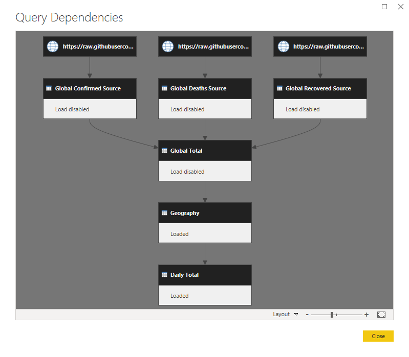 The engine will have to read each of the three files twice in order to make this work. Once for the Geography table and once again for the Daily Total table. If this were a SQL source the engine could pass the query down to the source system and the impact could be greatly reduced.
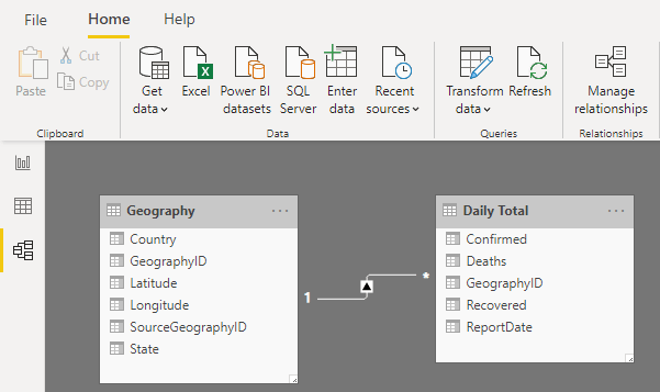
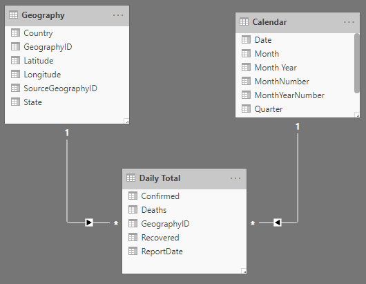
Data Model
Power BI should have detected the relationship between the two tables. You should see something like this on the Model tab.
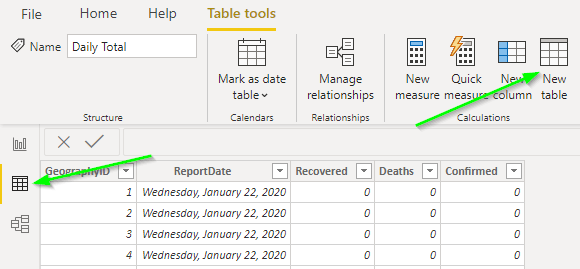
To do proper calculations in DAX that involve date analysis we need a proper calendar table. We will create it as a calculated table following a pattern which is inspired by Adam Saxton (Guy in a Cube) [blog|twitter]. More info in this video.
On the Data tab, click the New Table button.
Paste this into the formula bar.
|
|
Line 1 defines the table name. Lines 2 and 3 get the minimum and maximum ReportDate from the Daily Total table. Lines 4 and 5 convert these min and max dates into the first and last of the year in which they occur. Line 6 creates a table with one column (named Date) and a row for each date between the start and stop dates. Finally, lines 7-17 add descriptive columns to the calendar table.
You may have to refresh the data for the table to show any rows.
Create a relationship between the Calendar table and the Daily Total table by dragging Date to Report Date. The model should now look like this.
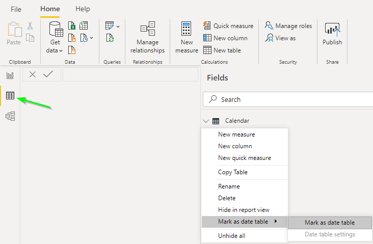
One final step is to mark the Calendar table as a date table. This lets Power BI know that the Calendar table should be used for the DAX functions that use time-intelligence features. Do this by clicking on the Data tab then right-clicking on the Calendar table and selecting Mark as date table > Mark as date table.
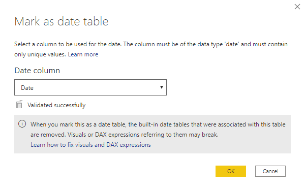
Select the Date column and click OK.
Can we make a visual yet?
Yes! Now we can make a basic chart. Open the Report tab and drag a Line chart to the canvas. Drag 'Calendar'[Date] to the axis and place 'Daily Total'[Confirmed] to the Values field. The result should look like this.
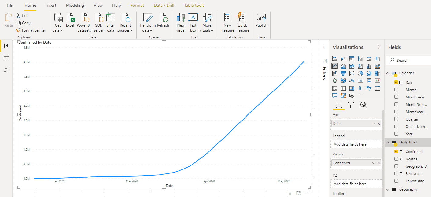
The totals are correct when displayed like this. As of 2020-05-09 the total confirmed is just over 4 million. If we change this line chart to a matrix, however, the total is not correct.
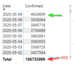
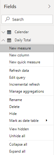
This is because Power BI is using the 'Daily Total'[Confirmed] value as an intrinsic measure and aggregating it by adding it up for all Geographies and all Dates. To get an accurate total we need to write a DAX measure. Right-click on the Daily Total table in the field list and select New Measure.
 Enter this code in the formula bar.
|
|
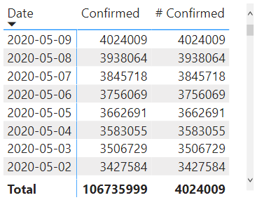
The code finds the last 'Calendar'[Date] which has a value in the 'Daily Total'[Confirmed] field. (lines 4-7) It then then sums the 'Daily Total'[Confirmed] for this date. This is a typical pattern used in data models that calculate an inventory or account balance. If we add the new measure to the matrix visual we can see the difference.
Repeat this step for # Deaths and # Recovered with the code listed here.
|
|
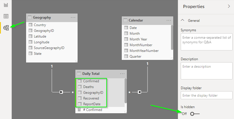
To avoid confusion we should hide the columns in the Daily Total table. The easiest way is to go to the Model tab and hold ctrl while clicking on the columns (not the measures) and click the Is Hidden button in the Properties pane. This way users will not accidentally use the wrong columns when creating reports.
Now we have a star-schema and some measures to begin creating visuals. In the next session we will add more complicated and more interesting calculations as well as polish the formatting so that our report looks professional and is easy to understand at a glance.